![]()
What do you know about the Western Union logo? When he started his business, the logo he had was not the one we know now. Do you know what the history of this company is? And how many times has the logo changed?
Below we give you all the data that, believe it or not, As a designer, they interest you because you will know a little more about a company and how it has made its logo evolve.
The history of Western Union
In case you don't know, Western Union is actually a financial company. It is in charge of transferring money around the world and in the United States it is one of the best known. And also one of the most used. Specifically, he was born in 1851, which was when he arrived in the United States, but the truth is that he has a presence throughout the world today.
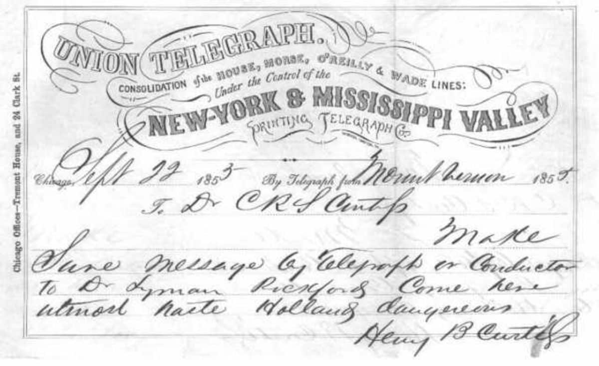
At first, the company was not called Western Union, but The New York and Mississippi Valley Printing Telegraph Company. Yes, that long name was the one the company had. And of course, when Jeptha Wade bought the company, in 1856, he changed its name to the Western Union Telegraph Company (and only at the insistence of Ezra Cornell who wanted his name to reflect that union of telegraph lines).
In fact, if you are wondering, you should know that yes, at the beginning this company was not dedicated to financial services (nor was it a bank) but rather its function was the telegram transmission service. But with the passage of time, and specifically in 1871, he decided to introduce a new service, that of money transfer. They must not have gone too badly when, in 1879, they decided to get out of the telephone business (also after a lost lawsuit with Bell) to enter directly into that new service, which became the main one.
It was in 1980 when he began to send money outside of America. In fact, when they saw that the main business began to decline, they knew how to turn the company towards a new beginning, but preserving the essence they had at that time.
The various Western Union logos
Roughly speaking, we can tell you that all the logos that the company has had have kept the same color paletteHowever, there has been a big change, especially between the first and the second.
The 1969 logo had futuristic letters written in black on a yellow background. In this case, the W and the U were given more prominence. The words Western Union were written below them.
This was something usual since they wanted to make themselves known above all by the initials (and considering that they came from such a long name, it is understandable.
But, as you know, Before that logo, and that name, there was another one before it. The Western Union Telegraph Company. We have found the logo and this one is totally different.
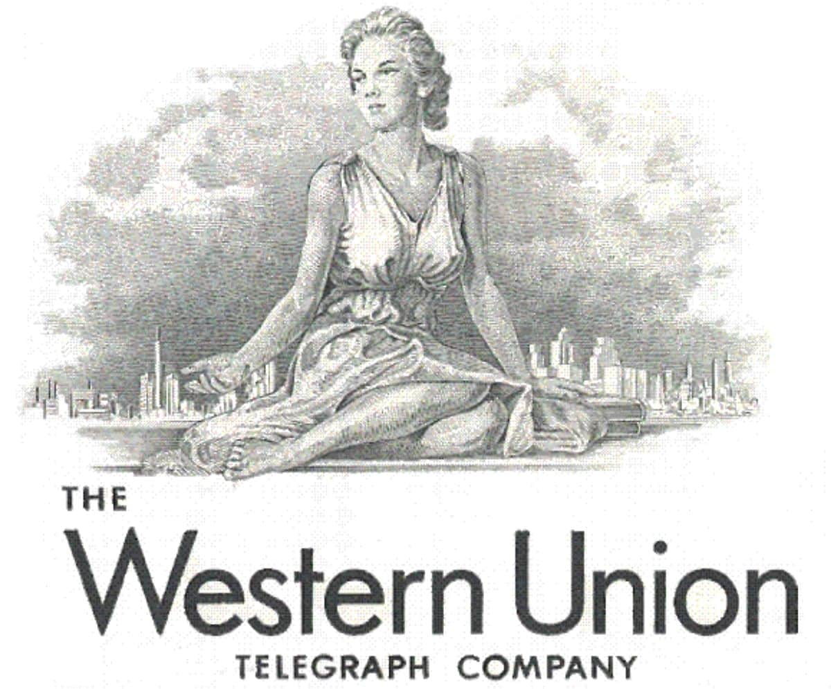
To begin with, it is in gray tones. It shows a woman sitting with a city in the background (we understand that it is the city where the company was founded), some books next to her and just below the words The, Telegraph and Company smaller than Western Union.
In fact, Investigating a little more we have found a document in which the original name of Western Union appears, in which we can see that they wrote it as follows: "New-York & Mississippi Valley (y en pequeño printing telegraph co.)".
The entire name was in gray with a black border, except for the small letters that had a softer typeface (with the P, T and C with some decoration).
The Western Union change in 1990
Since the logo was created in 1969, until it was changed in 1990, many years have passed. design wanted maintain the "presence" of the colors that were the protagonists and that identified the company. But he made a change. Instead of the background being yellow, they left this color for the letters, with black becoming the back color.
As for the source, they used a san-serif, mounting the word Western above that of Union and adding two yellow lines to one side of both words.
This was the first big change the brand underwent. But not the last one he's had.
2013: time for a redesign
![]()
In this case, not as many years passed as between the first and the second before they dared to change the logo again. and they did simplifying and redefining the 1990 logo. To do this, they kept the black background and the yellow letters again. But both the typography and the space changed.
As you will see in the logo, the distribution of the words was preserved, but previously vertical lines were slanted by increasing the size of the logo to include the W and U, the initials of the two words, in yellow (with a bit of white in the area where they both touched).
And we come to 2019
![]()
2019 was the last year in which they decided to make another change to the logo, surely to adapt to the changes that were taking place. And for this they decided to change the font to a sans-serif, but in this case leaving a single line in which, together, they formed the word WesternUnion. The two sloping lines were preserved, but much thinner and almost bordering on white, and also the initials WU.
In fact, and although it doesn't look very good when the logo is small, the point of the I in "union" is undercut and resembles a rising sun.
These acronyms continue to overlap but, unlike the previous logo (which had a black border and the silhouette of the U in white over the W), in this case we have to the U loses a little the end that joins it to the W.
As you can see, large companies also change their logo, although they try to maintain the essence for which they were known, in this case the color yellow and black. Did you know the history of the Western Union logo? Would you like to know the origin of any other logo?