
Trying to improve the experience of a user on our website, online store or landing page, is part of the evolution and continuous improvement for constant progress. Heatmaps, also called heatmaps, they provide us in a visual and simple way, which is what arouses the most interest, what should we improve, and what things barely work or do not arouse any interest.
There are certain "duties" that are higher priority than others, depending on what we are pursuing. And if it is about improving the online navigation of our users, the heat maps must take the first positions. For this reason, we are going to see what they are about, and what utilities they offer us. What ways to take advantage of them can we find. And what resources can we find to be able to integrate them into our sites.
What is a heat map?
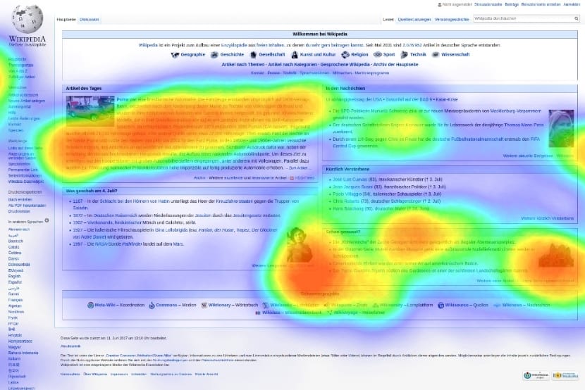
A heat map is a tool that allows us to know the behavior of a user or users through a representation of thermography on our website. From where you click, to where the mouse has passed. Also, what things have interested you the most and how long have you stayed in a place and stopped doing it.
To determine the areas of greatest interest, a color scale is used to determine the "hottest" (most interesting) and "coldest" (least interesting) areas. The range of colors goes from the coldest, starting with blue and green, to the warmest, such as oranges, reds and dark reds. Being able to identify the focus of attention, allows making the appropriate decisions to improve the experiences of the users and their interface to relate to the place.
Types of heat maps
The thermographic representation of the Heatmaps, as we have said, are represented in colors according to their level of attention. To do this, the colors are grouped around a "hot or cold" polarity. However, there is no single type of heat map. These They can be divided into 3 main groups depending on what we want to analyze. From the clicks, through the movement of the cursor, to the scroll that users make on our website (interesting option for long or infinite scrolls, as they have become so fashionable).
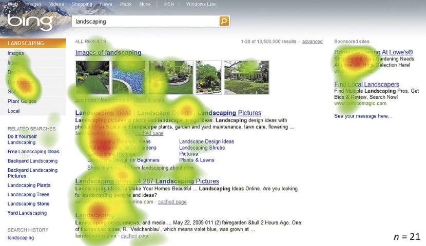
Clicks Heatmaps
By far, the most used. They allow making short-term decisions about the effectiveness of active elements on our website by registering user clicks. In this way, the specific elements that we can modify quickly, are the center of attention for heat maps based on clicks. What's more, By recording the actions of users, they make the degree of veracity and importance of these maps more valuable. They give little room for confusing data, because they analyze concrete actions.
Mouse movement heatmaps
These types of maps work very well in contrast and comparison with others. Especially because of the studies that exist in relation to where the user places the cursor. More than 80% of the time the eyes go where the cursor is going. And in the same way, more than 80% of the time the user's gaze does not end up directing where the cursor has not gone. This means that the data on user attention is not 100% accurate, unlike heatmap clicks. However, they are very close to reality, and they continue to be highly effective.
Scroll heatmaps
Very used in pages with a lot of scroll or "infinite". In this way, we can analyze the depth level of the user when scrolling and which areas are most interesting. In addition, they help determine if any unusual behavior is occurring, such as users leaving the page when viewing a banner. And it depends on the design and what is discussed in a section, they can interpret that the page has ended and there is no more content. Something that we can avoid by removing or changing the banner, for example.
Heatmap Utilities
The biggest benefit we can get from heat maps comes from the interpretation that we make of them. Areas that arouse little interest and we want to enhance, or clicks in places like images that lead nowhere. We can draw conclusions from all user behaviors. In the case of clicks on banners or images, which do not carry any link, it follows that they arouse interest. Therefore, it would be interesting if that click that users made, led them to something else that could be offered, adding a link. In case of not having available anything that speaks or relates to that passive element, the click can be redirected to some other element. The final idea revolves around avoiding the frustration of clicking something without effects.
In the case of active elements, it is necessary to analyze what does not work. Perhaps an element does not arouse interest or does not differentiate itself as an active element and is ignored. Or because it is in an area of other more attractive elements that attract attention. In these cases, or similar ones, it will be analyzed to understand what is failing, and remedy the situation.
- Example, highlight an element: Perhaps some other object is focusing attention. For example, a call to action of inconspicuous colors at the beginning of a post with a stunning image. It would be interesting to change the typology of the call the action, to change it of place or both.
I want to have heat maps, where to go?
There are various platforms that allow us to incorporate a heat map on our website. The best thing about them is their effectiveness, and the bad thing is that they are mostly paid. They can also help slow down the loading of the web (without being an exaggeration), so having another script installed, in addition, it will be convenient to modify the cookies to warn users (something simple to do).
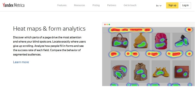
- Yandex Metrica: In this case it is free and can be tried in its demo version. They offer us heat maps of clicks and scroll.
- Heat map: Another tool that is free, yes, its interface is a bit complicated.
There are other tools that I did not include when paid, and that like the others, we can see the evaluations of them. Incorporating a color map, especially if we have a website where we offer services, courses, subscriptions, products or anything else, will be a smart way to optimize its operation. So in the end, we will not only have improved the user experience, but the benefits that we ourselves expect.