
When we talk about improving the user experience, We usually refer to how to improve customer satisfaction visitor to our website. To achieve this, there are certain basic aspects that must be taken into account, at least on mobile devices. One of them is to have a responsive design, which allows the correct display of the content of the entire website.
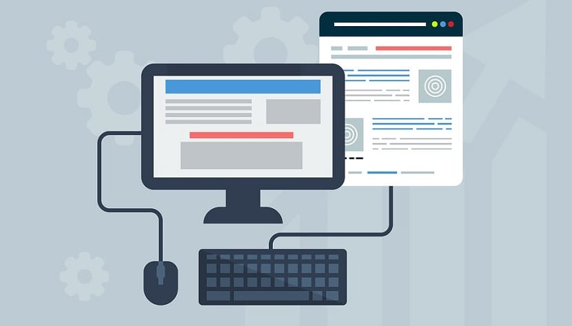
Despite this, there are different factors and keys that must be assessed for greater satisfaction. All of them will be focused on improving details from loading to displaying content, as well as facilitating the search and functions that users want to find. That is, to facilitate and satisfy their claims taking into account the motivations that have brought them here. Then, we are going to see all the keys to take into account to improve user experiences (UX) on mobile devices.
Value simplicity and make it effective
It is not strange to use the mobile phone while doing something else. Sometimes when we go by transport, we walk, we are waiting for a place ... We take it and make use of it often in those moments that we sense we can take advantage of to make use of it. Taking into account and evaluating when it is used, and that many users also tend to do it with one hand, simplicity must be given priority.

Overloading it with buttons and functions is not a good idea. Even less, if you plan to put stuffing things. In the end, overloading the page or App with features that are not expected, saturate and do not lead anywhere. We all like to get to the point, and more from a mobile. And keep in mind that the situation in which they are used, the user often looks up from the screen by external factors. Remember that if you look again, you must be clear and quickly where you were. Simplifying the web or App will contribute to greater effectiveness.
Usability for better handling
After simplifying the content, comes usability. Any web page or App it must be easy and useful to handle, so that its use is as satisfactory as possible. Not only the design, but the buttons and accesses that arise. Many people suffer from what in English is called "Fat Fingers", which come to be the big toes. It is very uncomfortable, annoying, and I am sure that it will happen to you the same, when we must click on a button that is stuck next to another, and we accidentally hit the one we did not want. This must be avoided at all costs, it also gives a very bad image.
Another thing to avoid is pop ups. They often make loading time difficult, and as we have already commented on many occasions on the blog, it is that reducing loading times is essential. If there is a lot of content to load, and you also have to wait for pop ups, many users leave the web "by legs", or the App may experience difficulties in its handling. You have to be careful with them. And of course, as I said earlier, the buttons. If the button is too small, and it is difficult to close it, it reaches a very unpleasant level of difficulty for the user. Remember, we users like to cut to the chase and not waste time.
A coherent, orderly and harmonious design throughout the web
In this section we would enter the type of letters, colors, design, etc.. It is convenient that it is uniform, and we know that we are browsing the same website. Not only in the content, but also in the images. Taking care of details such as placing the same or similar letters, colors, and that the images are closely related to the content, will keep the personality of your brand afloat.
Un homogeneous design Together with the range of colors, it will keep the user in tune with your App or website. Also monitor the size of the fonts, and that the call-to-action (CTA) buttons are well visible. If, for example, the user has to fill in a form, it should appear decently. Imagine if it costs you to load, visualize, you have to expand it, or whatever. With all that it takes to get to this point, we are not going to make it difficult!
Intuitive navigation

There is no standard user that we can focus on for navigation. But if we can make the different options and gestures as similar to how we know them. Click, scroll, hold ... etc. Innovating in this case to be creative does not go well. If the user proceeds in one way, without finishing obtaining the result he was looking for, we can enter the risk that he thinks that either it does not work well, or that something is wrong.

Certain analysis tools will help you to better decide how to arrange the different options and in what way. In addition also the location of the buttons, analyzing for example, with heat maps.
You can see that the most effective way to improve the user experience is taking into account what you yourself would like to find. Put yourself in the place of the other, and you will discover that it is that you must improve.