
The years 2016 and 2017 were full of the news, mobile devices surpassed computers when browsing the web. From different countries, the analysis tools found how the connections had increased, and it could be seen in the graphs. This has created the need to optimize web design and adapt it to mobile devices. Also, for a few years, Google has updated its algorithm to give priority in its search engines to the websites with responsive designs (multi-device).
In this article you will find the keys and tips to adapt your website and optimize it for mobile devices. You will be able to reach a larger and increasingly growing audience, improving your positioning and visitor traffic. Remember that although you offer the same, a small screen cannot store everything visible from a web nor does it have such a powerful processor. Priority, accessibility and speed will be present throughout the process.
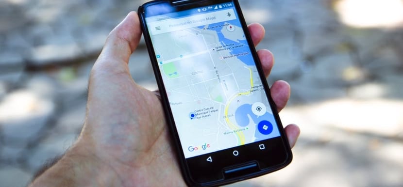
Mobile device screens are small
The first thing that must be adapted from the webs is the design towards mobile devices, which have the smallest screens. Years ago, when smartphones emerged, it was typical to enter websites that were not adapted. And even the user, assuming that such a problem existed (because it was quite frequent), could try to navigate (with frustration) if the content was really of interest to him. Not currently, the first thing the user will do from his mobile device is enter, and if the web is poorly structured he will leave it, because there are many other well-enabled ones.

In the same way as the content, the usability of the buttons. Also emphasize their visibility, and make it easy to click on them. Not having a mobile-friendly website nowadays gives a frankly bad and carefree brand image.
That the web has an agile and fast load
The loading speed from a mobile is not the same as for a computer. SEO, user satisfaction level, visibility, etc. will depend on this. Users are increasingly impatient, and that is because if there is any failure to load a website, the first impression is that something is wrong. Usually all websites tend to load fast. And why is loading speed so important? Because it is proven that 53% of users leave the web if after 3 seconds it has not yet loaded. Let's not talk about the websites that take 6 or even 8 seconds, where practically most of the traffic is lost.
Choosing a web design that is optimized for mobiles will allow you to streamline and adapt content such as videos or images. In this way, the page load will be faster, without losing users. One of the most used plugins (in case you use WordPress) and that I recommend is the WPtouch Mobile Plugin. Automatically and independently create a web version adapted for mobiles, without touching or damaging your version for computers. The initial theme will be different from the one you may have, but in its paid version, you can choose between different themes. Likewise, it is a better solution than not having your website adapted.
Otherwise, you can always opt for a plugin that helps you improve the loading time. In the case of WordPress, we can find in the AMP plugin. If you don't have WordPress, you have the AMP developed by Google. Accelerating navigation will also make you gain position in the search engine.
User behavior is different
Connecting from the mobile phone implies a different way of relating, even from a web. There are things that you will have to adapt to make more accessible to visitors such as call-to-action buttons. A person when entering, should have quick access to know where everything is, and not to navigate without finding or seeing something that may interest him / her.
Improve accessibility and interactivity with what you offer
In line with the previous paragraph, a user interacts differently from their mobile. Many options that you can take for granted from a computer version, are not for a Smartphone. One of the examples that comes to mind is offering your phone number. If a user wants to make a call to make a purchase, question or any query, telephone access must be provided. And although on the computer, that your phone appears on top (overprinted) of an image can be very good, it is very frustrating from the mobile to click and nothing happens.
In the same way, if you provide a physical address to locate your business, creating a drop-down with a map to find you improves the user experience. At the end of the day, you have to take into account what people can expect of you. Meeting the expectations of your users is always a good idea.
In the same way, any other type of access, contact, you must facilitate it. Remember that everything is viewed from a mobile phone.
Check that your website is mobile-friendly
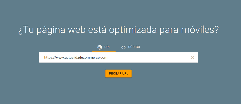
Use tools to check if your website is properly optimized for the mobile version. Google has tools available for web analysis, and they could not miss it to analyze your mobile-friendly website.
- Operational. Coming into Mobile Friendly Test, we can find out if our website works correctly from a mobile device. In case there are errors, the panel on the left will indicate what they have been, so that you can solve them easily.
- Loading speed. La PageSpeed Insights is another Google tool and designed as its name suggests to check that it has a good loading speed.
Try the mobile version for yourself
Obviously, this option could not be missing so that you can assess yourself if the changes you are making are on the right track. Do not forget that if you show the web to a family member or friend, ask for their most sincere opinion. Compare your website with others and see if you are doing the right things.
In the end, it is not so much about everything being perfect and pristine, unless you have a high-end website and can spend more on it. But for yourself you will end up verifying that by compressing images, not over-saturating with plugins, and prioritizing content, you can gain extra speed.