
Throughout these days, we have talked at length in this blog about how to improve the user experience. From different tools, such as using the experience improvement for conversion, etc. However, perhaps the most elementary of all, lies in the design that we can have on our website. And it is noteworthy that even Google offers more priority to this type of website in its search engine, because adaptability also rewards it.
For that very reason, We are going to see what factors are involved in web design, which allow us to focus on the user, and improve their experience. Get your satisfaction also appreciated by Google, and get more traffic on it. Because a better user experience and SEO are closely related.
What should I value in improving the user experience?

Before you start, you should keep certain questions in mind that you can answer.
- What kind of audience do I want to attract? o What type of audience is the web for?
- What does that audience expect when they enter my website?
- What desires and motivations push you to enter my site?
- What level of facility do I offer you to meet your expectations?
By answering the above questions objectively and realistically, you can get an idea of how to conduct your web design. Sometimes, the fact of adapting and making changes helps us to have a clear idea of how it should be. To know if we are successful in the best, It is also necessary to assess other aspects. They can be from how much time users spend on average on our website, if the text is easy to read from any device, if your content mixes different media to make their experience more enjoyable, and if your user can reach the services or products you offer with at least two clicks. Whenever something can be provided, it is almost an obligation to do so.

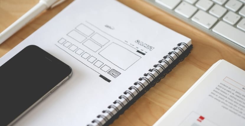
Structure of the web
To get started, you must strive for a theme that is very clear and visual. Overload with content and buttons and menus and links and tabs and… You see it right? Even reading saturates, imagine if it is with content. I know there is a need to make everything we offer visible, but uploading content to excess can block. Above all, for newcomers, that in the end, if you keep a user, they will always have been a newcomer at some point.
I imagine that sometimes, you have come to a website and it will have been difficult for you to find what you were looking for. That is what you should prevent from happening on your own. You must get the user to find what they are looking for, with simple glances. A clear and visual menu and structure. Less is more.
Design adapted to different devices
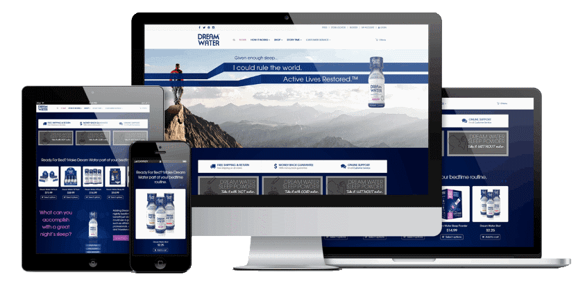
Adapting your website with a responsive design will improve your web positioning. But you should take into account from which device most of your users usually come to place more emphasis on the design for that specific device. Remember that the way users interact from each device is different, and that the design must be facilitated and adapted to each circumstance.
Take care of the content of what you write on your website
And with this I mean more about the layout of the text than what you write. It's not that it doesn't matter what you say, but not everything has the same relevance and not even most people are going to read it all to you. To do this, you must facilitate access to the content that interests them, highlighting the most important aspects. Namely:
- The titles. Depending on the theme, and including subsections in them. Everything we call H2, H3, H4… etc.
- Bold and italics. Especially in case you include long articles on your website, and for the most impatient users. In this way you will have a clear and fast view of what you are talking about and the most important content.
- Strikethrough. Crossing out can be a good technique, it can even be a bit enjoyable depending on the purpose for which you have it.
Even to say nonsense and nonsense. - Colors. Don't make a rainbow either, but use colors that go with your design, or logo, or spirit. Remember that each color has a certain analogy with feelings and themes.
- Typology. Clear and easy-to-read letters. That the gimmicky ones can be very beautiful, but they quickly tire the eyes.
It also avoids the huge ramblings, however important the content is. Faced with a large block of letters, users tend to jump their eyes to the next point.
Web loading speed
It is annoying and the longer a website takes to load, the more dissatisfaction it generates in users. Take care of the codes, the cache, the weight of the images, plugins, avoid flash animations, etc. There are pages that take horrors to load, and unless a user knows that what they will find on your website is just what they are looking for, because they have already visited it before or for whatever reason, you can easily lose them.
There are plugins to help you in this process, in this Ragose website you will find many depending on what you are looking for. In the same way, remember that the loading speed for each device is not the same, and that the web must be adapted to each device.
Home page that specifies what the user will find
And by way of conclusion, none of this would work if you did not specify in advance what the user will find on your website. Many of them will leave if they see that their expectations are not met, or they do not really know what they are going to find and even less what it is about. Each home page has its tune with the product or service you are offering. It will not be the same design that a website that sells products for motorcyclists uses as that of a meteorology blog.
Make sure you have a home page that explains as a presentation what it is about, what content to find or offer, and with versatility, to always facilitate user interaction with it. It is also an opportunity for user conversion. Remember that the first impression of a person on a website tends to condition behavior and future evaluation with that website.