
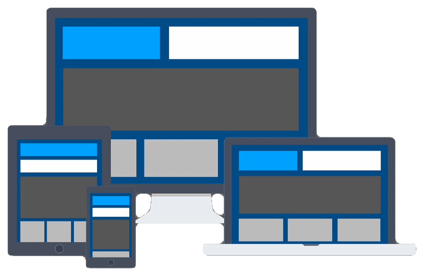
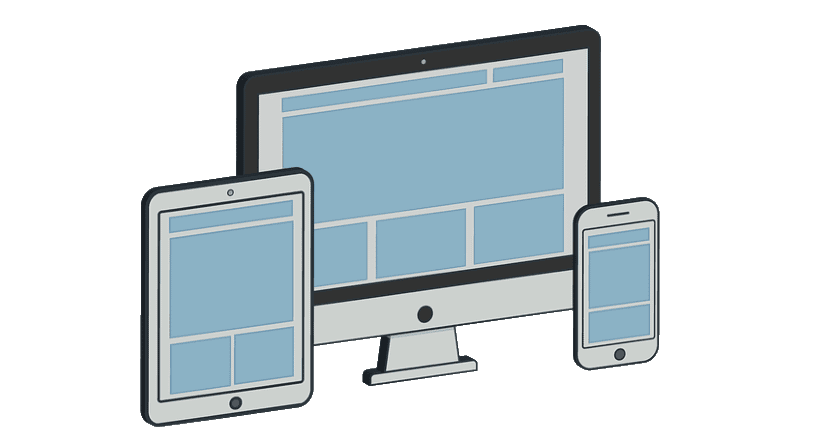
Also called adaptive design, adaptive design, or responsive design. Responsive design revolves around modify the appearance of the website to adapt it to the device from which the page is being visited. In this way, the user experience improves significantly, and it is one of the SEO optimization resources that Google strongly raises. Taking into account that since 2015, it changed its algorithm to reward those websites that did.
But responsive design is more than just a mere display of each device. It offers us the possibility of modifying the design (without doing so) and genuinely adapting it to each device. To enhance our SEO, and that our website is not relegated by others that do incorporate it. In the end, it all adds up, and today we're going to talk about responsive designs.
Responsive Design
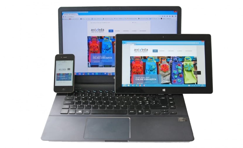
It is essentially the adaptation of a website to each type of device from which it is intended to connect. In the past, the internet was only accessible from a desktop or laptop computer. Currently, we can find connections from mobile phones (which is the most common), tablets, electronic books, etc. The first effect that is noticed in case of not having a responsive web design, are basic failures of the type, a bad structure, or that the device does not support certain visualizations. This is due to the screens, the processors they carry, the operating systems, the resolution or the memory is different in each device.
Thanks to this type of design, from a single HTML and CSS it is possible to solve and solve all the previous problems, which for example are very popular among fixed width designs. What's more, the need to maintain each of the websites is unified in one place. You will achieve better and more optimal results, and a lower workload.
How to transform a website to responsive design
You have different ways to achieve it. Obviously the ideal case is if you start from 0, but we are going to list them.
- Create a mobile version. Essential and then we will talk about it. This is the most "cumbersome" way, but you will get the same benefits (with a little more work). By having a lower desktop weight, and the option of better images, you can improve the speed of your site. If for example you use WordPress, you can use a Plugin, which is the cheapest and fastest. For example, him wptouch pro.
- Use a responsive predesigned template. In the case of WordPress and other content management systems (CMS) such as Joomla, they generally have almost all of their templates with responsive design today.
- Download responsive templates. The best of these cases is that they manage to detect the size of the screen of each device and adapt the content to it. Of course, you have to bear in mind that each type of product or service that you offer will be more interesting than another. A blog template is not the same as another for a kitchen supply store.
Why does Google prefer responsive design?
Google is today a perfect balance between efficiency and quality, which translates into effectiveness. The fact of having an adaptive web allows Google 2 things. On the one hand, offering in their search engines places that care about offering maximum comfort to their users, and on the other hand having to index only one place.
Sometimes, it is easy to choose a design for the computer, or even create a mobile website and put all the efforts there. But it is a mistake. The workload that is generated is double, not only for repeating the process two or more times, but also for trying to double position a website. In this case, the most successful thing is to lean towards a responsive design, which allows us the connection and visibility from any device by indexing a single website.
This algorithm does not affect computer searches, but since 2016, most searches are no longer made from them. Something serious to consider, if you need visibility on the net.
The importance of adaptive design
Many users can enter your website and lose them almost instantly. Having a website that is poorly structured is not comfortable, and if you do not have a responsive design, it can generate these problems. For example, from the visualization of a mobile device, which is used more frequently every day.
But you think ... Nothing happens, my user profile for the services that I offer are inclined to the visualization from a PC! You're sure? The only thing that is achieved is to obtain a high bounce rate. And either because your content is not good, or there are structural problems on your website, etc., search engines can interpret that as a bad sign. Especially because in the end, people spend little time on your website. Therefore, in parallel, your positioning can be affected, starting to decrease positions. What in a way, It is not that it is a bad idea to adapt your website to multi-devices, but it is necessary. Hence the importance it has.
I hope you have seen the importance of having a responsive website, and if you don't have it, go for it! It is one of the most basic things to consider today.